
ESMA LIGATURE LOGOS
- Nov 23, 2016
- 1 min read


Ligature Logo Project: Grace O’Dwyer
Date: 11/23/16
What is a ligature logo?
A ligature logo is a logo that blends two or more letters into one.
How would describe the corporate identity of ESMA in 5 words?
Epic
Diverse
Enthusiastic
Fun
Passionate
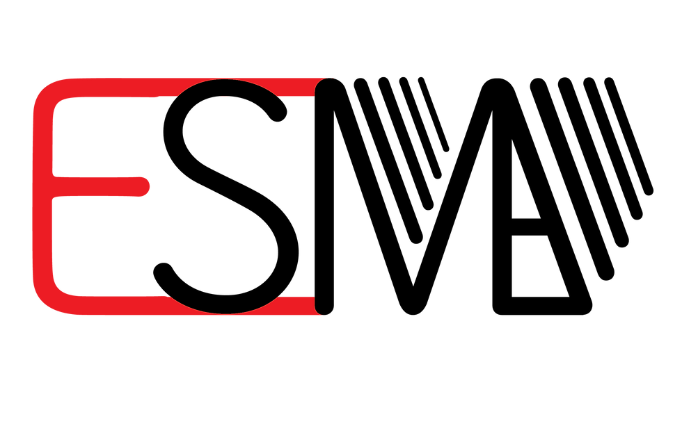
Which logo out of the two do you feel is the strongest and why?
I feel that my strongest logo is the red and black one. I feel that this is my strongest logo because I feel that the colors represent the company well and the embellishment makes it interesting. Although I feel the letters flow better together on the other logo, I feel this one had an overall better composition.
If you had no requirements or restrictions how would your logo look different?
If there were no requirements, I would try to make the logo either a square or make it vertical I think that making the logo vertical would give it an interesting composition. I would also use for colors in my logos.
Explain which ligature techniques you have demonstrated on each logo:
In the red and yellow gradient logo, I used shared strokes and almost identical shared strokes. IN the red and black logo I used shared strokes, angled to vertical, and embellishment.


Comments